Home » Blog » SEO Tips » What you need to know about Mobile First index!
Mobiles are becoming the trend of today. People no longer only rely on their desktop for any form of access or program usage, everything is made portable and available via your phone. This brings us to the question, how is Google utilizing this development?
During the last years, Google engineers had created and optimized Google bot algorithms on how it can crawl, index, and rank web pages. Google is on its way to greater mobile developments with the rise of the phone era and for those who don’t have a mobile site yet, don’t freak out, Google said they would continue to index your desktop, even if they were using a mobile user agent to view your site. This brings us to the point of the mobile first index system.
So what exactly is the mobile first index update?
The mobile first index means Google will start ranking both the desktop and mobile version of a website based on the mobile version itself. Google said they were still in the process of experimenting their index mobile first, although for now their search index will continue to be a single index of website and apps. That said, even though their index will be built from the mobile document, Google said they would still ensure a great search experience for all users – whether mobile or desktops.
Meanwhile if your website is RESPONSIVE, it will not be affected!
So the concept of the mobile first index includes using the right algorithms that will eventually use primarily the mobile version of a site’s content to rank pages from that site in order to understand structured data and to show snippets from those pages on the Google search results.
Mobile version types
Some websites show their mobile version via responsive design, meaning both desktop and mobile sites use the same HTML file and the CSS is adjusted based on the device type browsing the site.
Other types include websites with separate versions for mobile and is usually hosted as a subdomain, such as m.example.com. If users reach the website from a smartphone, it will be automatically redirected to the mobile version. Whichever version you’re using for your site, you should optimize your website for this new update!
Best practices for mobile-first indexing
Mobile-first indexing means Google will predominantly use the mobile version of the content for indexing and ranking. Historically, the index primarily used the desktop version of a page’s content when evaluating the relevance of a page to a user’s query. Since the majority of users now access Google via a mobile device, the index will primarily use the mobile version of a page’s content going forward. We aren’t creating a separate mobile-first index. We continue to use only one index.
With mobile-first indexing, Googlebot primarily crawls and indexes pages with the smartphone agent. We will continue to show the URL that is the most appropriate to users (whether it’s a desktop or mobile URL) in Search results.
As we said, we transition sites slowly to ensure a good experience for site owners and users. We evaluate each site individually on its readiness for mobile-first indexing based on the best practices and transition the site when the site is ready.
Google prefers the mobile optimized content for indexing. To prepare for mobile-first indexing, follow our best practices.
AMP and non-AMP
Your site has both AMP and non-AMP versions of a page. Users see two different URLs.
Google prefers the mobile version of the non-AMP URL for indexing. If your non-AMP mobile version uses dynamic serving or separate URLs, follow our best practices.
Mobile first index metrics
There are a few steps you need to take in order to prepare yourself for this update, which includes the following metrics:
Optimize website speed for both desktop and mobile version
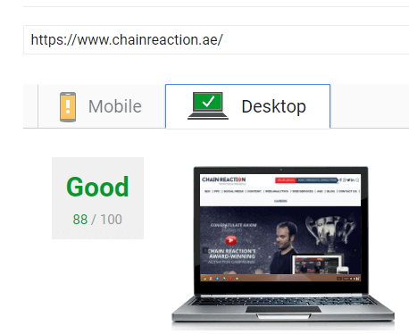
Speed is always important for anything online-based, especially when it comes to web browsing. It is a vital part for a direct SEO ranking factor so you should care about the points listed in Google Page Speed Insights – you can check out the speed for both mobile and desktop sites here.
The following screenshot showing that the desktop is Good, while mobile need some improvement.
Implement Accelerated Mobile Pages (AMP) update
AMP was launched by Google to enhance the speed load of a page by six times. It was originally specified for publishers and news websites, however, nowadays it supports nearly all website types.
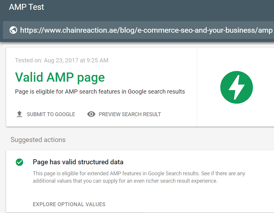
It is important to enable the AMP from a UX and SEO point of view. This will also make your mobile website ready for the mobile index update. You can test your AMP website here.
As seen in the AMP test in the screenshot, the page is valid
Mobile friendly
Many digital marketers have realized the importance of creating a mobile friendly website – from a user’s or UX perspective as well as in the eyes of Google bots. One of the effective ways to test how Google render or see your website is by going to Google search console and then click Fetch as Google from the Crawl tab, then choose the smartphone bot to test your mobile version.
You can test how friendly your mobile site is on Google here.
As seen in the screenshot, the page is mobile friendly, however, there are some page loading issues related to some plugins, and 3rd party use, but as long as it’s mobile friendly in eyes of Google and users, then don’t worry!
Structured Data Testing
Structured data is also an important aspect to take into account, even though structured data is not a direct SEO ranking factor, it is still an important element for Google and other search engines. Structured data doesn’t only benefit SEOs or increase the CTR on search results page, it also uses attributes such as open graph og that improves how the page is shown on social media pages when somebody shares it.
Content
Content is the king and always has been one of the most important elements for SEO – less content means fewer opportunities to rank on Google, so when you design your mobile version, make sure to present as much content as you can. Even Google still suggests the “Read more” CSS trick, tabs, accordion, and expandable boxes.
Meta Tages
Meta tags are the core of search results ranking, your mobile website should include separate pages so separate meta tags (title, description, canonical, H1 body tag) .
Internal links
You should keep your mobile version links well-structured and as rich as possible. The main goal is to pass the internal links’ authority to the inner service pages or main products for e-commerce websites.
URL Structure:
You have to keep your URL structure clean and easy to navigate, even having SPA web app doesn’t prevent you from having separate pages URLs that let Google understand your website structure and content thus give the needed keywords ranking potential for your pages.
The mobile first index is not yet in effect, however, if you have a website out there and would like to keep your viewership in place, it’s important to keep up with the latest trends; in this case, you should always keep your mobile website version ready for any updates. So make sure to apply the above metrics in order to be safe and rank well!
Hope you enjoyed the article, feel free to contact us for any inquiry!
